
What are histograms, dot plots, density plots, and contour plots?
Flow cytometry data is a collection of tens to hundreds of thousands of cellular events. The data being used for each event is fluorescent intensity, which in itself is derived from a voltage / time output from the detectors (see Electronics for more info). The fluorescent intensity for a specific group of cells is not uniform, and variation is always observed, with some cells fluorescing slightly more or less bright than others.
The fluorescent distribution of cellular events can be visualized in a histogram, where cells are binned (counted) for a discrete fluorescent intensity value (from least to greatest fluorescence). The figure below illustrates the concept of a histogram by showing a normal-like distribution of cellular fluorescence (left). The histogram distribution can be analyzed for statistical values such as mean fluorescent intensity and cell count.
Dot plots are essentially two-dimensional histograms, with a histogram on each axis; but instead of plotting a curve, individual dots are shown for each cellular event. The figure below illustrates this concept (right) by showing a dot plot with the associated histograms for each axis. There are three groups of cells, which have been colored to show how, interpretation of the data can change depending on the order of which histogram is being analyzed.
Density plots are a variation of dot plots, where the events are layered as a “heat map”, where events are colored more “hot” (red) the more events overlap/coincide. See second figure for an example.
Lastly, contour plots are much like density plots. However, whereas density plots display overlapped events with a colored heat map, contour plots visualize the data like a topographic map. Where contour lines (e.g. akin to elevation lines) display regions with higher event overlaps. Contour plots are a great way to visualize very noisy data with many cluttered single events, as the contour lines result in a more minimalistic view.
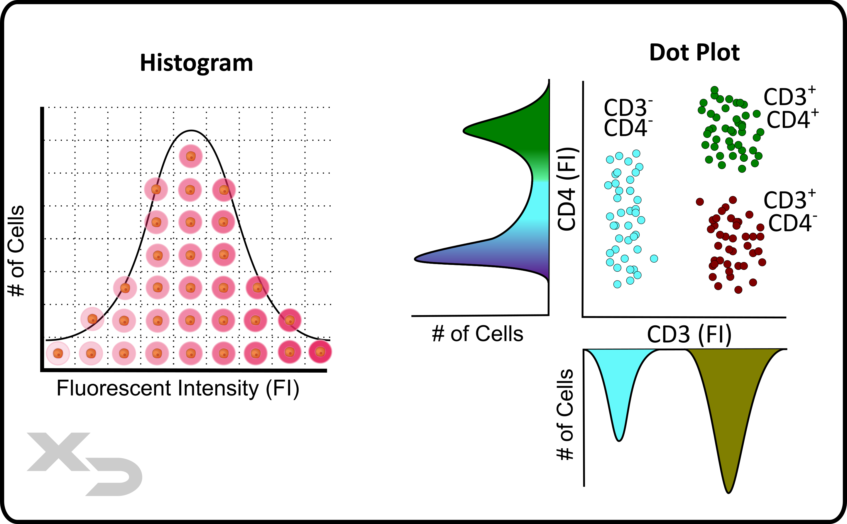
Figure: Histogram and dot plot example. A histogram curve is a graph of # of cells at a specific fluorescent intensity. Dot plots are in essence a 2-dimensional histogram, where individual cellular events are plotted for two factors (example: CD4 and CD3 fluorescence).
Flow cytometry has single cell resolution, e.g. it measures cells (events) one at a time. Because the data is separated between discrete cellular events, the user can select the data points (events) they want to analyze in a process known as gating. That way the final data excludes extraneous events that may either confound the results, or make visual interpretation more difficult.
Gates (e.g. regions of interest) can be drawn around a population of events. A new plot can then be created, where only the events within that gate are displayed (e.g. ungated events are ignored/not shown). This is perhaps the single most important feature of flow cytometry; as layering gates (e.g. sequential gates) allows the user to narrow down on sub-populations of cells. For example: Tregs (CD45+CD3+CD4+CD25+FOXP3+) can be differentiated from activated T-helper cells (CD45+CD3+CD4+CD25+), which can be differentiated from T-helper cells (CD45+CD3+CD4+), which can be differentiated from pan-T-cells (CD45+CD3+), which can be differentiated from lymphocytes (CD45+).
There are a variety of ways to draw a gate. The figure below shows several variations of gates (in order): elliptical, polygonal, quadrant, range gate, and bi-range gate. Additional gates (not shown) are freehand gates and box gates. These gates fall under one of three broad types, which affect how the data is collected:
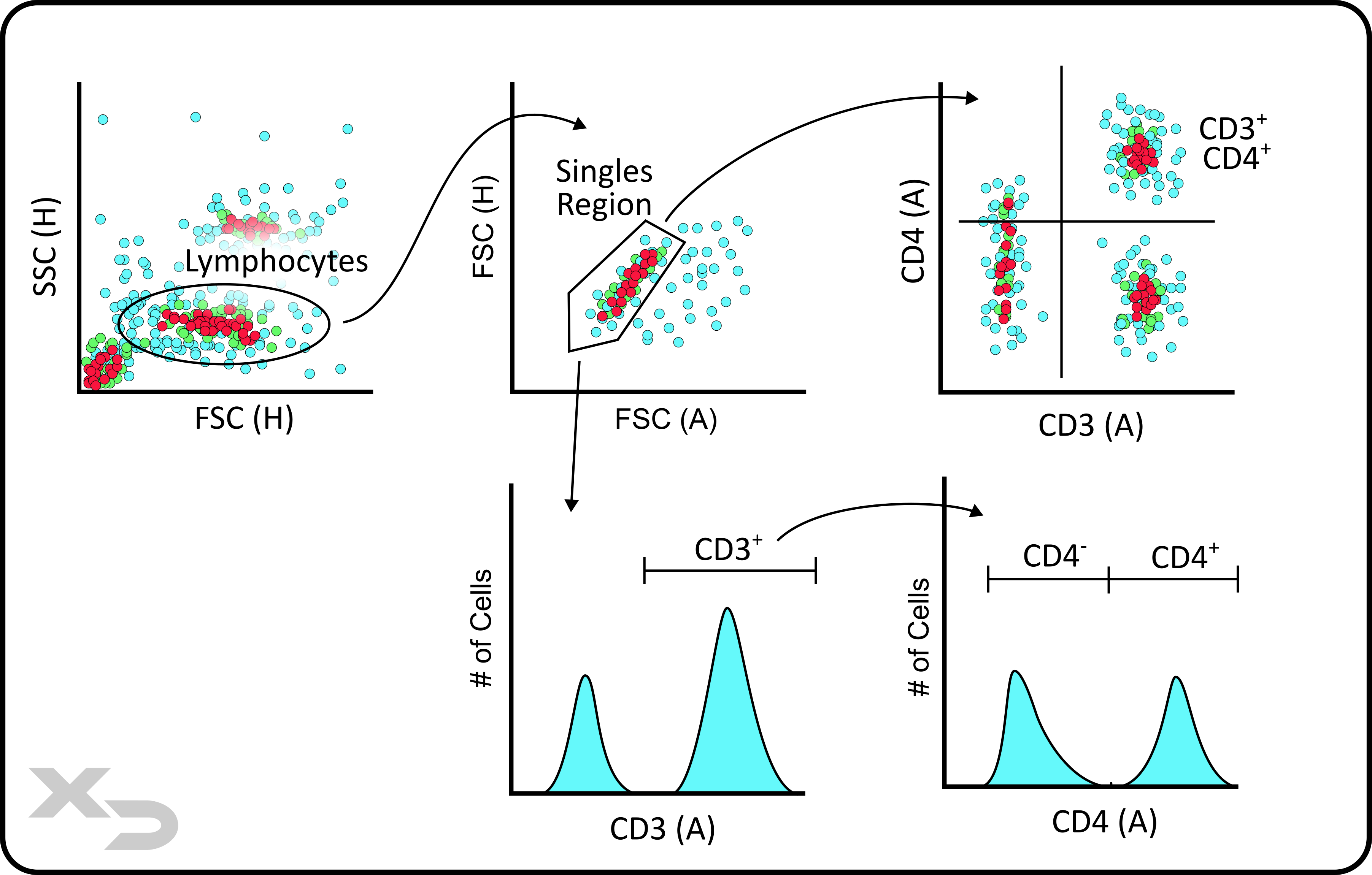
Figure: Gating example for CD3 and CD4 T-cells.
When setting gates, it can be difficult to determine exactly where the boundary should be, especially if there is no clear-cut divide between the population of interest and unwanted events. Controls, specifically fluorescence minus ones (FMO’s), can be used to determine where gates should be placed.
FMO’s are negative controls for a single fluorescent stain (e.g. contains all stains except for one). Using an FMO, gates should be drawn at the edge of the negative population. Ideally, 100% of the FMO events should be on the “negative” side of the gate.
On occasion, there may be some few highly fluorescent events, and it may be necessary to set the gate below those auto fluorescent events as long as those events are relatively few (e.g. <2-3%). This occurs more often when 1 or 2-axis gates and histograms are used; as the linear axis gates leave little room for nuance, and histograms similarly do not convey as much information as dot/density plots. This is why it is recommended often to use enclosed gates (e.g. polygonal gates) on density plots, as the gates can conform tightly around the desired population.
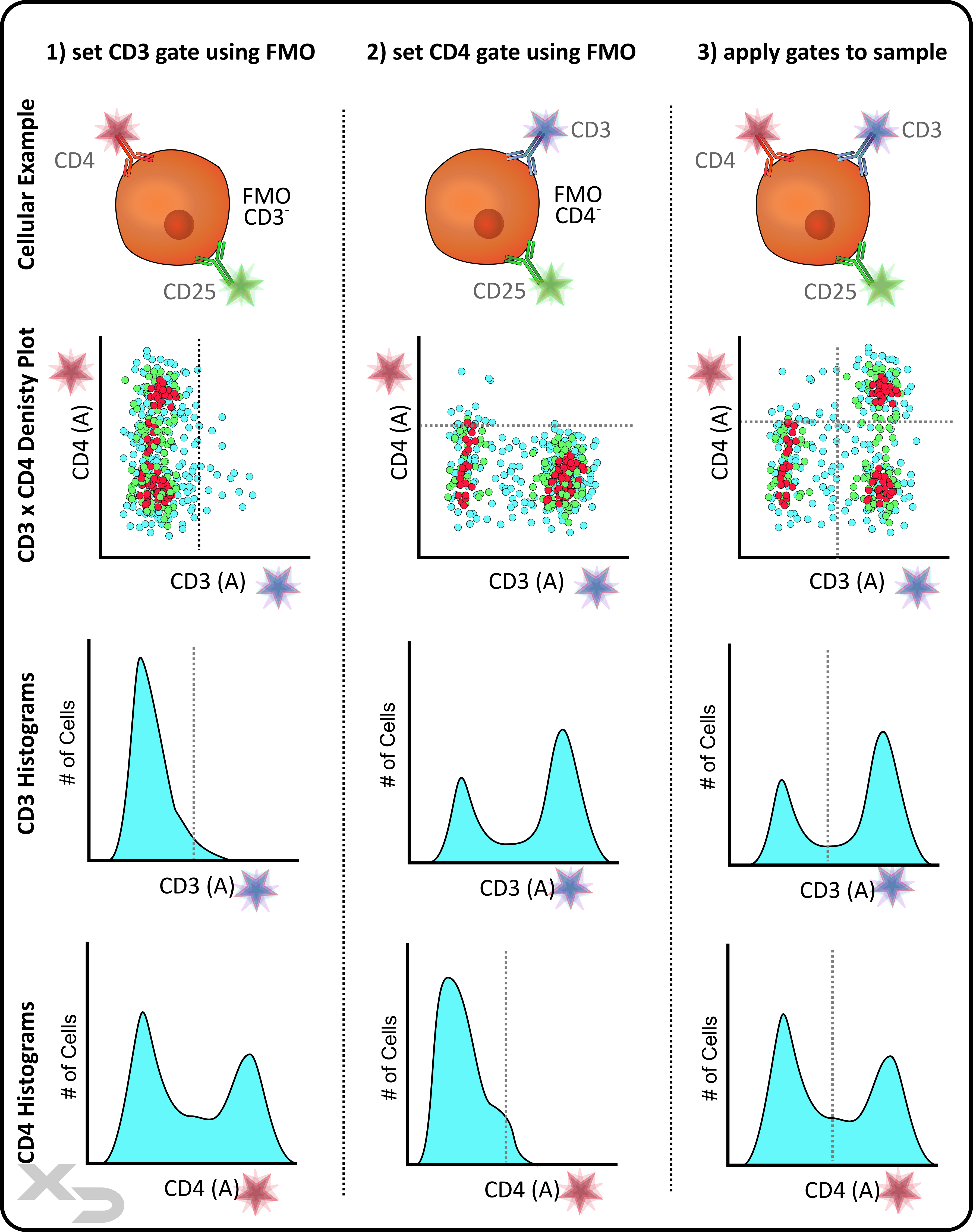
Figure: FMO Example of a 3-color study. The example focuses on 2 of those colors (CD3 and CD4). FMO negative controls are used to set the gates (e.g. just above the negative population). The example illustrates what those gates may look like when applied to either density plots or histograms.
There are four basic primary statistics for numerical data which can be collected from flow plots: counts, mean (or median), variance, and percentage.
Count – the number of events (either total or within a gated region).
Count data can be useful to verify that enough meaningful cellular events for statistical confidence are collected; typically 100-1000 at a minimum. Count data can also be useful for enumeration and analysis of cellular proliferation, as relative changes in cell counts can be monitored from sample to sample. If count is combined with analysis of fluorescent intensity (e.g. in a histogram plot) additional proliferation data can be obtained when using cytoplasmic proliferation dyes. The figure below shows how, as a cell divides into two daughter generations, each daughter cell receives half of the dye from its parent. The number of peaks can be used to identify the number of generations of the cells, and integrating the counts for each peak can determine frequency of each generation. From that data, additional statistics can then be calculated, like proliferation index and division index.
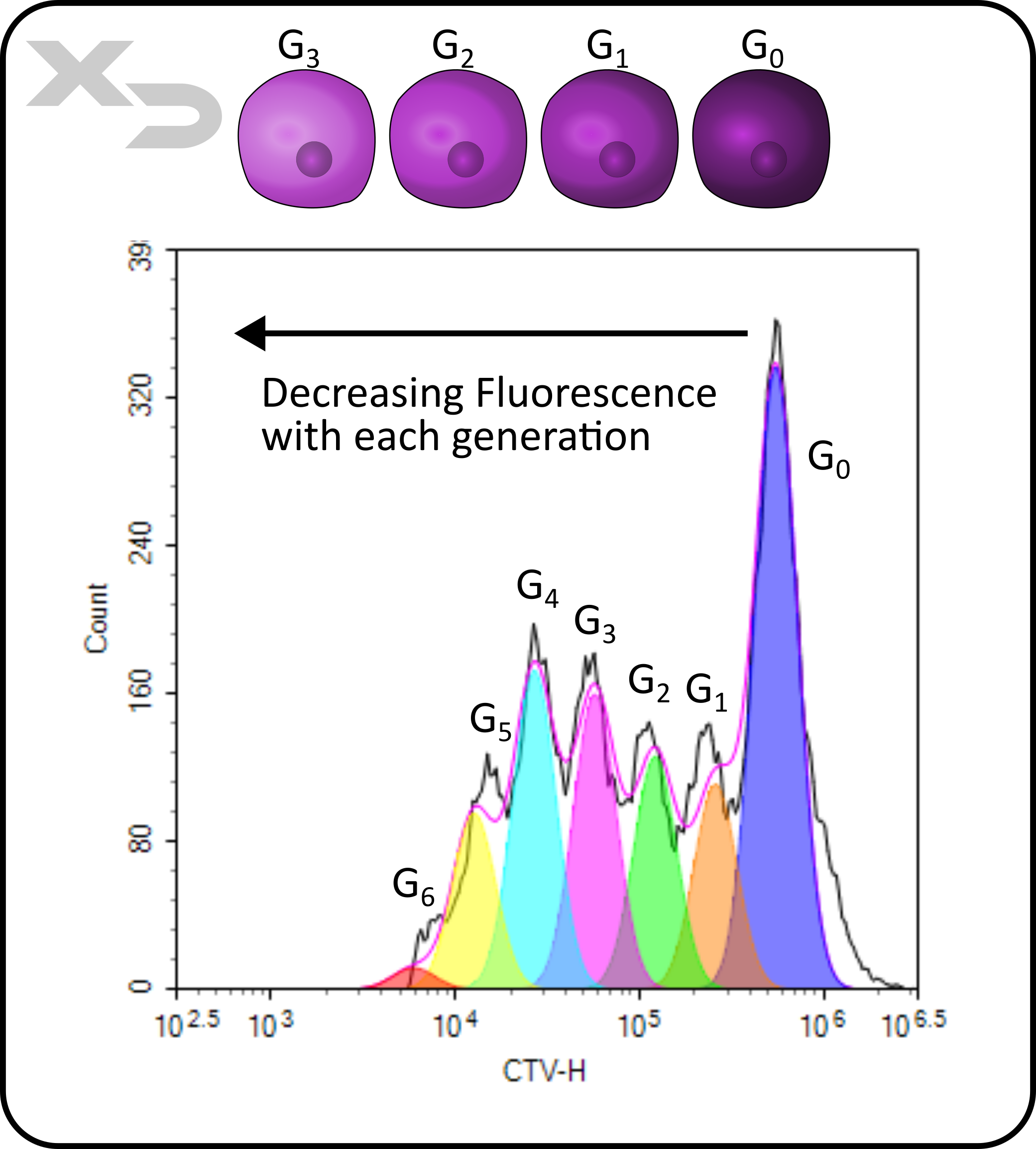
Figure: Proliferation analysis of stimulated T-cells. Generations (G) are denoted for each interpolated peak.
Mean or Median – the average (or median) fluorescent intensity.
Mean (or median) fluorescent intensity (MFI) is among the most useful data that can be generated, as fluorescent intensity directly correlates to the abundance of a particular target (e.g. marker) in or on the cell. While truly quantitative data cannot be obtained for the exact quantity of those targets, the relative fluorescent intensities (rMFI) between samples can be incredibly valuable for monitoring changes in target abundance.
This works best for data with low spread (variance) of cellular events. If instead the sample has wide distribution or multiple peaks, then assessing the average may not adequately convey the change in target abundance/distribution. Percentages are often used instead for these cases.
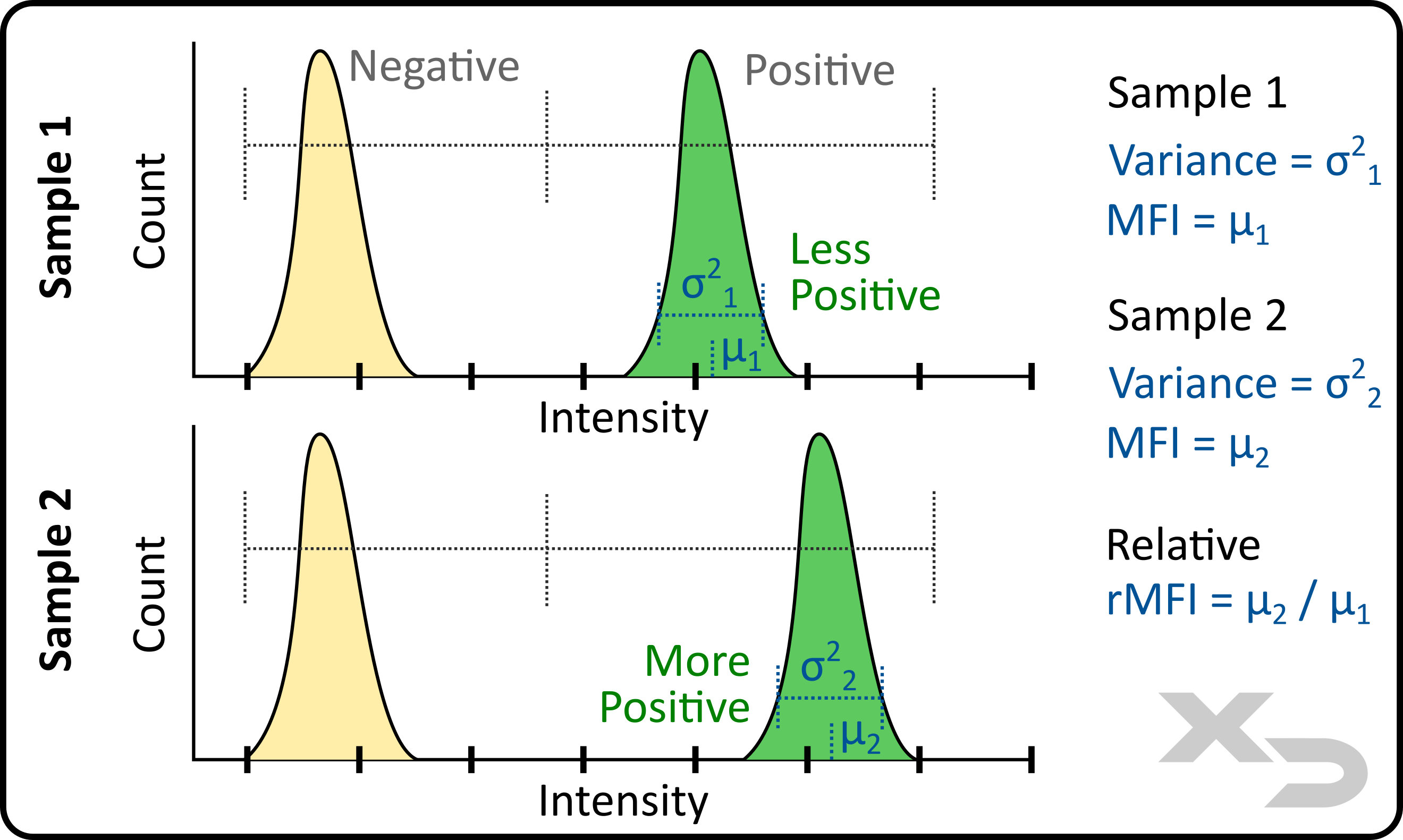
Figure: Analysis of fluorescent intensity mean (µ) and variance (σ).
Variance – spread of fluorescent intensity for the events.
In addition to MFI, the variance and standard deviation of the fluorescent events can be calculated. From this the coefficient of variation (CV) can also be calculated.
Percentage
Using gates, the percentage of events that fall within the gate can be calculated. Unlike MFI, which is intrinsic to the sample and depends on abundance and distribution of markers, percentage calculations are only dependent on where the user sets the gating threshold. These thresholds are often best placed based on controls (unstained, FMO’s, or other negative controls).
Percentage is best used for samples which have wide distributions. The example figure below illustrates how two such samples can be analyzed. Because the distribution of the fluorescent events is so wide, the relative change in MFI between samples 1 and 2 is not overly large. The difference in MFI can still be used; however, by setting a bi-range gate to calculate a percentage shift, a greater relative difference between the two samples can calculated.
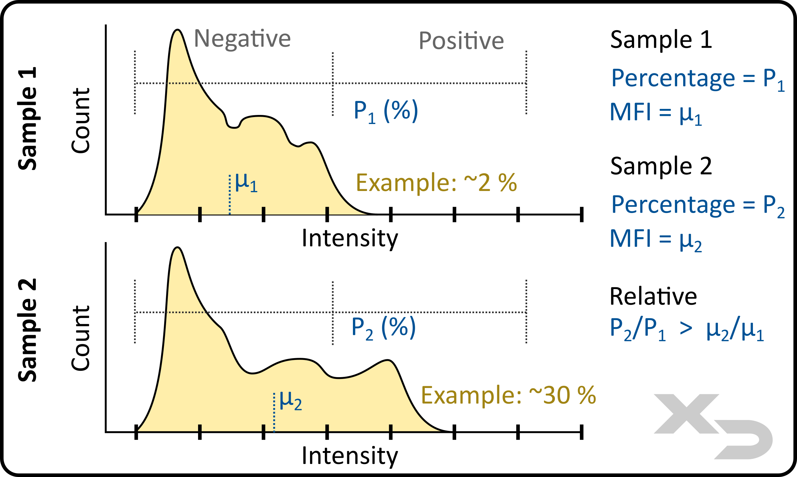
Figure: analysis of percent positive set by bi-range gate. Locations and values of mean (µ) and percentage (P) were not calculated; this is an example illustration.
Time
While not often used, most flow conventional flow cytometry instruments also record the time the event was collected (e.g. time from sample aspiration to when a particular cell passes the interrogation point/detection). As sample solutions are often mixed well prior to aspiration, samples are relatively static (homogenous) over the read time. However, this data can be used to diagnose instrument issues, such as sampling errors or critical failure in performance of optics.
There are a wide variety of graphical and statistical operations that can be performed on the base data. These operations are case dependent, being tailored to a specific study to answer a specific question. However, we’ve listed three common examples below.
Stain Index
Stain Index is an analysis term most often associated with optimization of a stain panel. Optimizing for stain index involves titrating the amount of antibody stain used to obtain the largest relative difference between a negative (unstained) and positive (stained) population (e.g. Stain Index). At its heart, stain index is a calculation of rMFI between two populations; however, it also takes into account the variance (standard deviation) of the populations.
Statistical Comparisons
Comparisons between two samples can be made based on the base data (e.g. counts, MFI, and percentages). Comparisons can be a simple as a T-test, or as complex as a 2-way ANOVA with Dunnet multiple comparison. It all depends on the study design and what questions are trying to be answered.
Curve Fitting
Event data can be fit to a curve. This is often performed when titrating a therapeutic, or assessing changes over several timepoints. Depending on the specific curve used (e.g. linear, polynomial, sigmoidal) additional statistical parameters can be calculated. Below, we show an example of a dose-response curve for several articles including calculation of EC50 (effective concentration at half maximum).
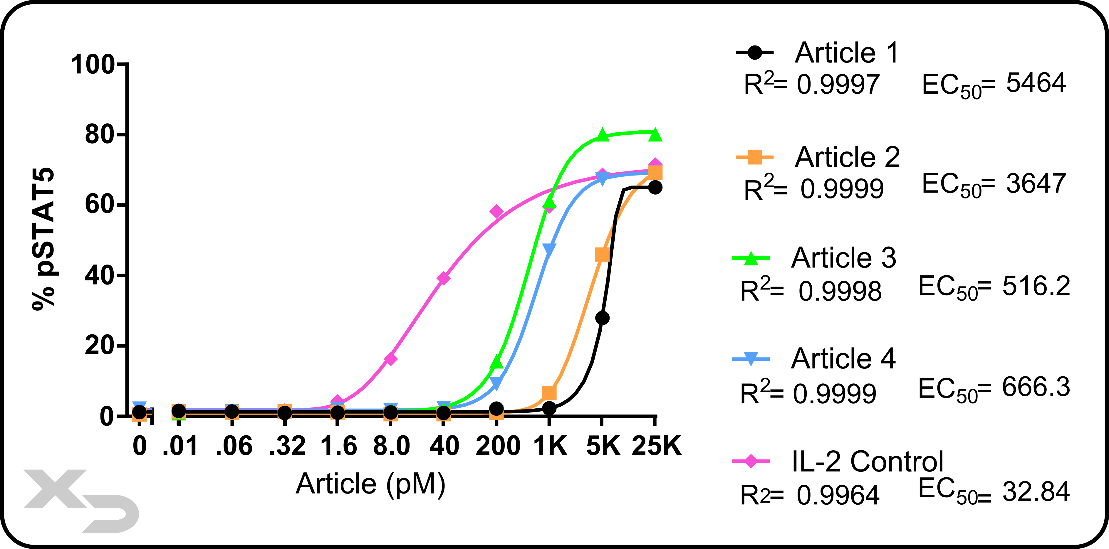
Figure: Example study of a intracellular pSTAT5 assay by flow cytometry. PBMCs were treated with various articles at different concentrations. pSTAT5 was assessed for Tregs (CD4+CD25+FoxP3+). Asymmetric sigmodal curves were fit; R2 and EC50 (effective concentration at half maximal) were calculated.
We have designed several informational pages with custom graphics to help explain the complex concepts of flow cytometry.
"*" indicates required fields
Copyright © 2021. All rights reserved.
